Categories
About us

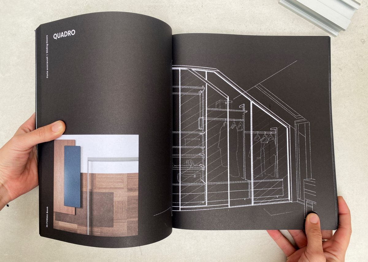
It is out: the new Informa catalogue with art direction by este’r partners

Informa has presented its new catalogue to the Hungarian public: the Italian company combines aluminium machining with high technology to meet market needs where functionality is combined with elegant, lightweight appearance in the field of doors and storage systems. In addition to the production unit in Hungary, Informa’s headquarters in Székesfehérvár has been expanded with a professional showroom.

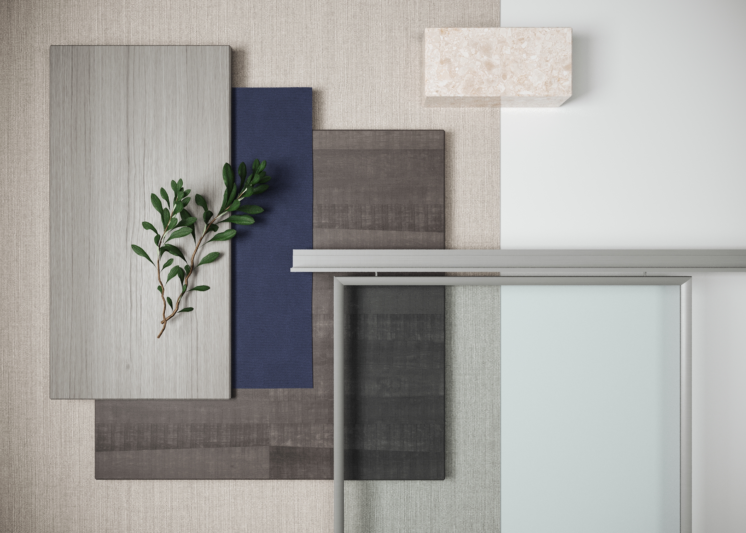
Informa manufactures filigree doors and windows, concealed and sliding doors using natural, brushed and surface-treated profiles in various metallic shades which can be aligned to divide entire spaces. Their storage systems are also flexible with a variety of systems for all types of office and residential storage. The systems have the advantage of mobility, flexibility and stability during use, but also a modern and state-of-the-art look.


Este’r partners has been asked to create the new Informa catalogue. With a designer’s approach and a deep knowledge of the product range we have designed the spaces in the catalogue to present Informa’s product range. The graphic and stylistic design of the catalogue, photography, technical drawings, illustrations and hand-drawings are also the creative work of our office.

Art Direction by este’r partners

Artistic coordination by Fanni Gyurics

Graphics by Márk Gelley

Visual design by Lars Lovas

Hand drawings by Bianka Bánóczi

Technical drawings by Hajnalka Zellei

Printing by Pauker Nyomdaipari Kft.


Categories
About us

Colorful and bold: Supersalone in Milan

An extraordinary exhibition in a new concept. After one and a half years of postponement, Milan’s renowned architect and urban planner Stefano Boeri (designer of the Vertical Gardens, Giardini Verticali and other buildings) has come up with the idea of a furniture and design exhibition to be held in September at a different time from usual. Interior designer Eszter Radnóczy tells us about this year’s Milan Design Week.

This year the organizers’ idea was to show the latest products of the manufacturers in a museum-like concept, in order to reduce costs and increase transparency. I spoke to several of our partners before the exhibition, they were excited and a little disappointed. Disappointed, because there was little time to prepare, and many did not even want to participate, saying that it was risky, there would be few visitors, it could be canceled at the last minute due to unexpected consequences of the virus, and there would be no opportunity to show the full range of products.

I arrived at the venue with curiosity and left happy after a day’s visit.

The event was transparent, with companies lined up neatly one after the other, mostly with strong messages and stands that trigger curiosity. Creativity could also be seen in such a small space of a few hundred meters and the distinctive characteristics of the manufacturers were recognizable. Of course, anyone familiar with the vast and endless exhibition at the Salone del Mobile was certainly not expecting this. However, the latest product, an important message, a creative idea about the product, its appearance or its quality, quickly found its space.

There was no need to register to visit the stands, no need to look for the owner or representative, they would just sit on the sofa on display or behind the counter. I enjoyed this democratic approach: I could sit next to them, have a conversation and everyone seemed more relaxed and considerate than usual. Surely this concept favors professional visitors, previous knowledge of products and manufacturers is necessary to understand the different exhibition.

Milan Design Week is not just about the exhibition at Fiera, but also about the venues outside. This week, design dominates the city more than usual. The permanent showrooms will offer special programs and installations to visitors. Smaller manufacturers, who do not have showrooms in Milan, will organize joint events.

The “big ones” are looking for venues where the space in itself offers a great experience. A multitude of palazzos welcome visitors, where the old and antique meet the new and innovative. Milan is colorful, very colorful and, as always, bold. Everything is bright, shiny, too big, too small, rough and soft. Contrasts come together in a surprising proportion and become a defining experience.

Now to some of my experiences in detail:

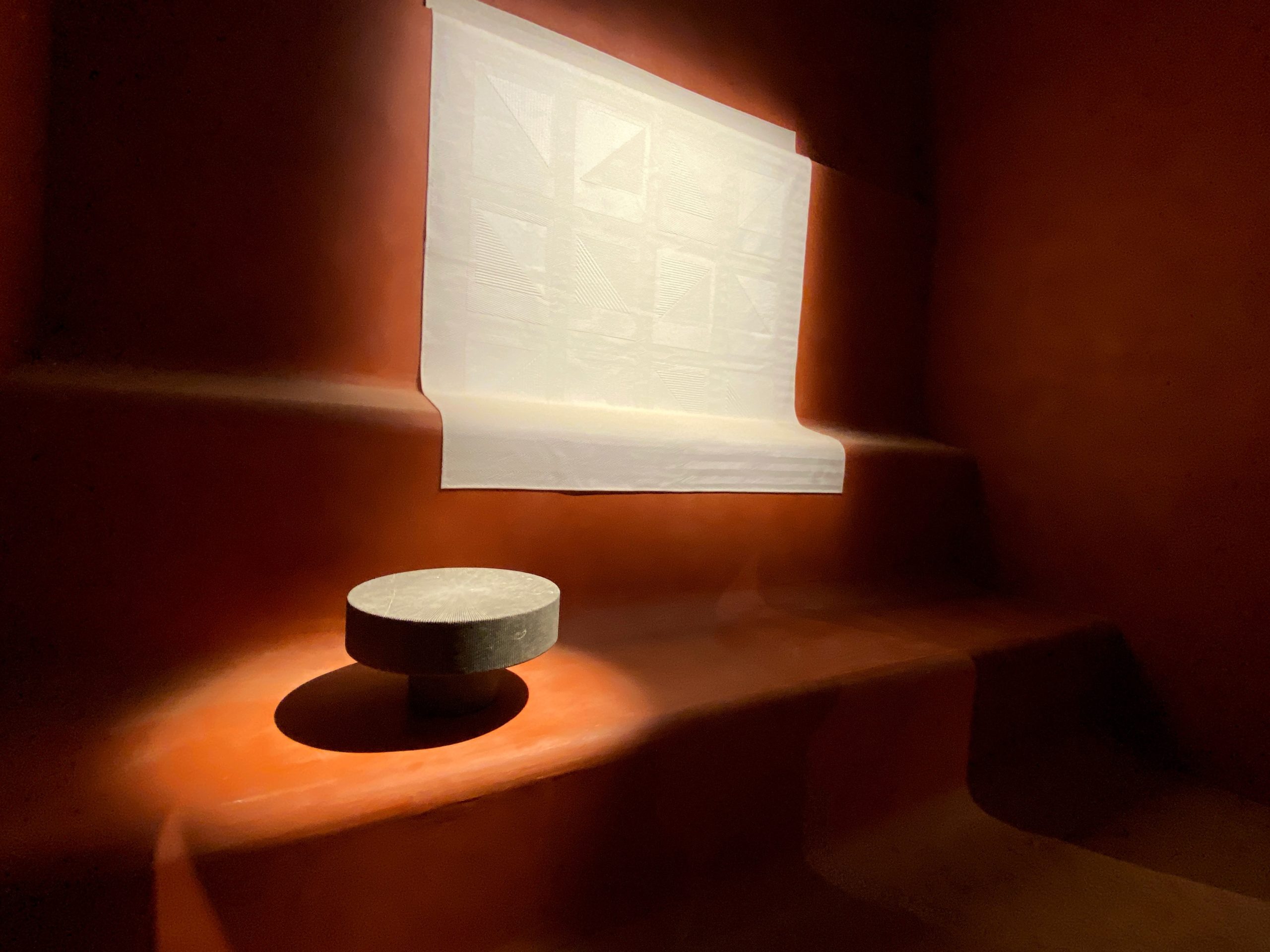
Besides Italian design, I’m in love with French creativity. I love French design because of its eclecticism and its fantastic handling of geometry with curves and when it combines nature with technique. It’s truly fabulous. The Hermés exhibition in the Brera district was just like that. A village decorated with colorful geometric patterns, impulsive interior stages set within huge rustic clay walls, an experience of objects, space and color, the concept that combines tradition with innovation which is linked to Charlotte Macaux Perleman.

The French Institute in Milan is a beautiful building in itself, with a monastery courtyard in the centre, near the Basilica of Sant Ambroggio. At Fuori Salone, we had the opportunity to see designer Piere Nigro’s furniture in collaboration with Mobilier national. The Armadillo collection of furniture allowed the manufacturer to demonstrate virtuosity in woodworking. The exhibition presented the structure and logic of small pieces of furniture made up of solid wooden rectangles. The other product, the Hémicycle seating range, was produced in collaboration with the French manufacturer Ligne Roset, who was involved in its design and upholstery. The furniture’s metal frame and structure showed the creative technology in pieces.

The Nilufar Gallery in Via della Spiga and the Nilufar Depo always has surprises in store. Nina Yashar presents large-scale, eclectically selected projects and unique pieces, which she discovers through meticulous research and further develops with designers.

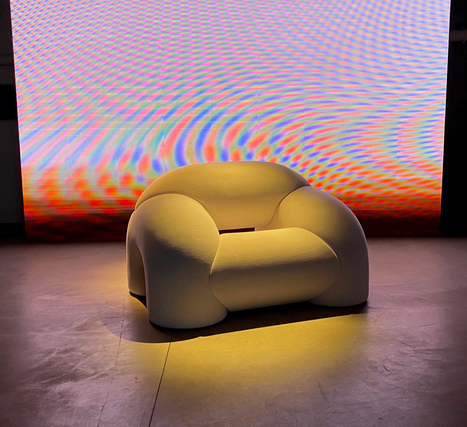
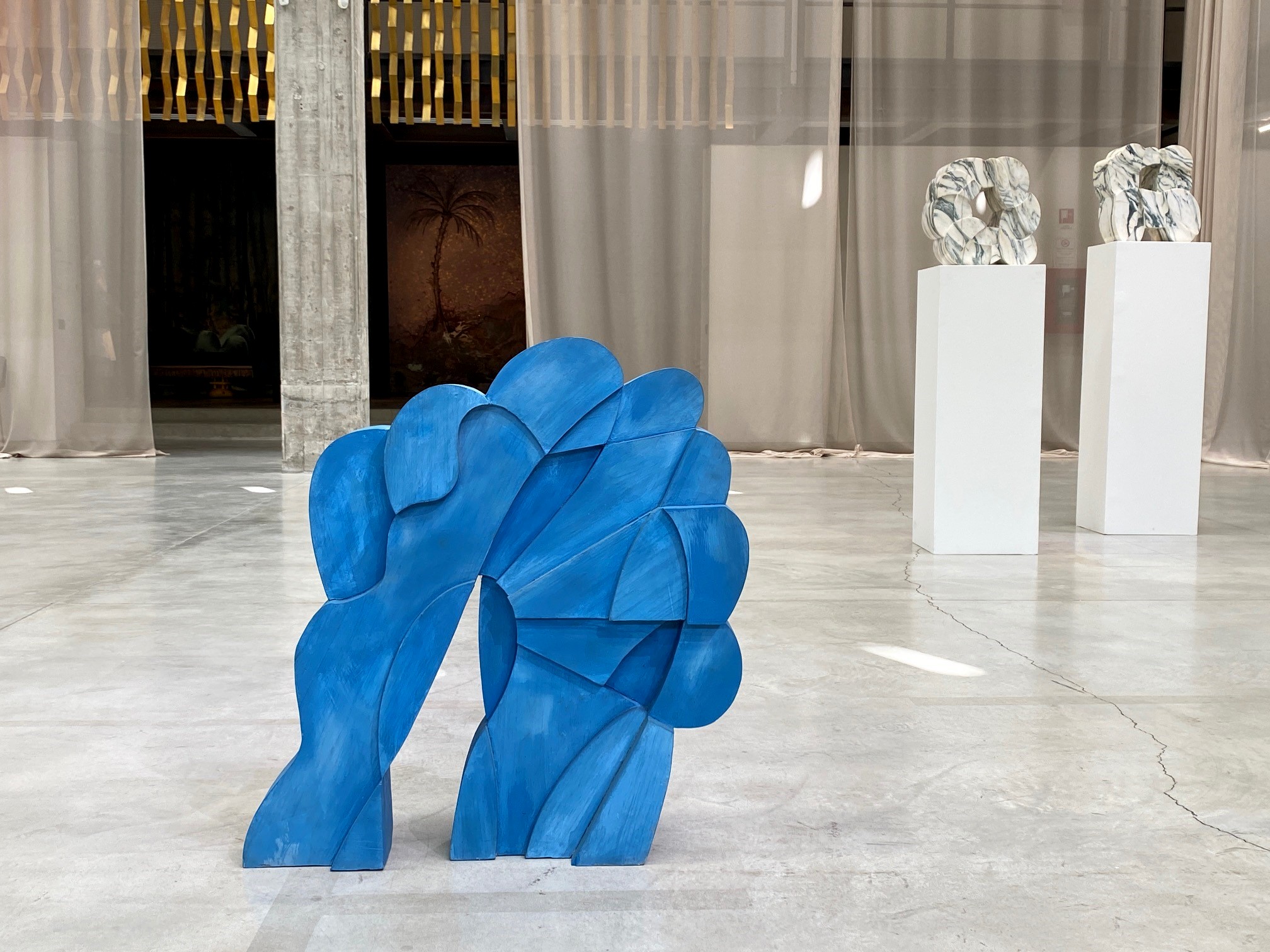
Entering the monumental atrium of the industrial building, we can admire the sculptures of Pietro Consagra Matacubi, born in 1920 and part of the largest international contemporary collections. The building’s stage is dedicated to the so-called Odyssey exhibition, where Andrés Reisinger’s first Italian show was held.

The designer talks about the relationship between the digital and the real world through a dialogue between the furniture and the projected image.

Last but not least, the installation called Jungle, by Khaled El Mays, is a work of beauty and sustainability.


Categories
Rólunk

Postcard from Italy: a journey with interior designer Eszter Radnóczy

This summer, after a long break, este’r partners team was finally able to travel again. We visited our Italian partners, met our colleagues and we also discovered old and new places in and around Milan. Eszter Radnóczy tells us about her Italian memories and shares her favorite photos.

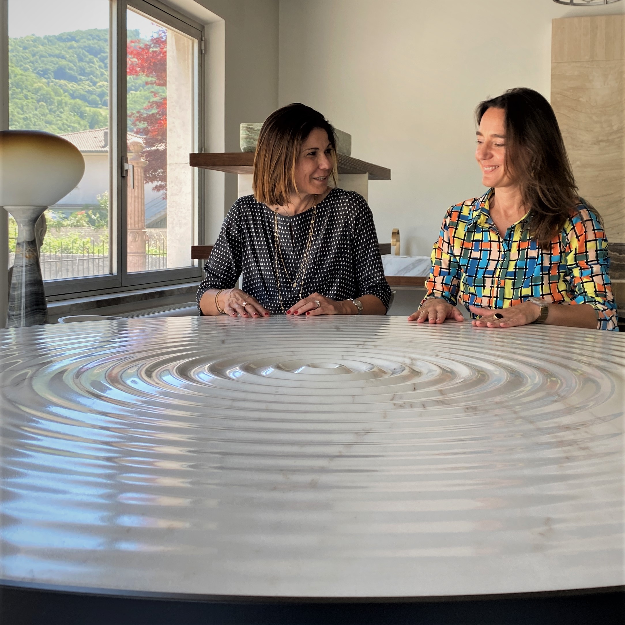
Italy is not only a place of inspiration, but also a place where I find ideas and moments of joy. This time I visited the Kreoo showroom, where Alessandra Farinon, one of the owners, welcomed me. Kreoo’s marble washbasins, carved from a block of marble, playfully and creatively soften the material’s austere, dignified look. The name of the freestanding, sculptural Gong washbasin in the picture refers to Tibetan bells, which evoke a thousand emotions with their sound and appearance – they are unique not only visually, but also when you touch them.

Next to the Pluvio table. On its surface the waves of water droplets, splashed in the middle of the table, are distributed centrally. At the edge of the table, the waves are so smooth that the surface is almost flat.

The ADI Design Museum, located between old buildings, opened a few months ago as a modern exhibition space in Milan’s China Town. The permanent exhibition presents the winners, designs and products of the Compasso d’Oro from the 1960s to the present. Many iconic pieces are on display so we can better understand the evolution of a product. The museum’s architecture and interior design plans are associated with the internationally renowned architectural firm Migliore + Servetto.

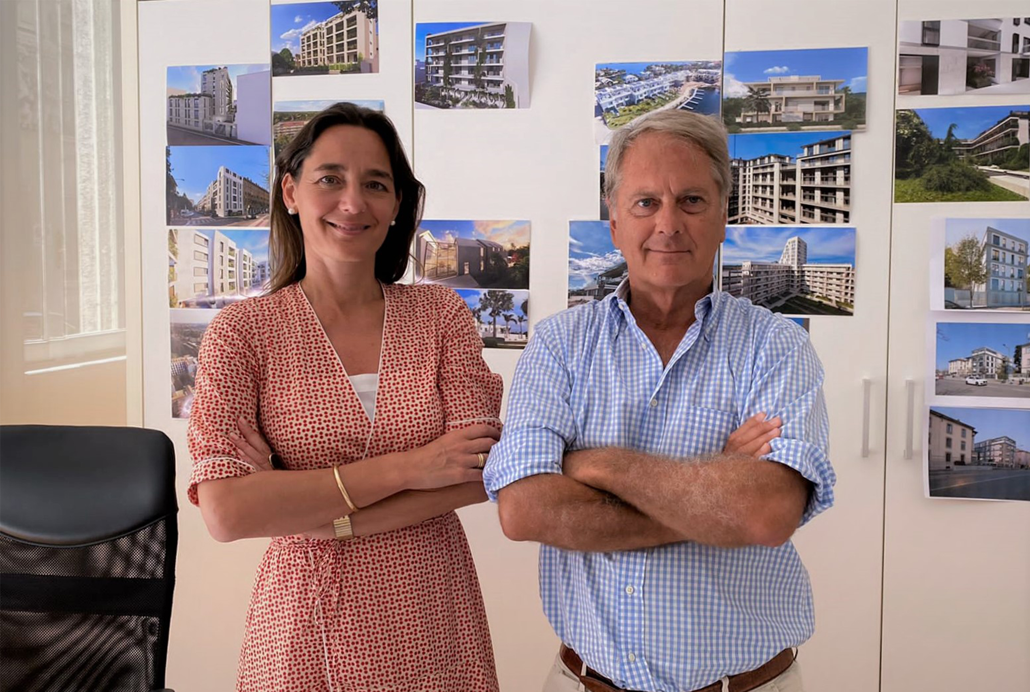
In Milan, my first visit is always to Stefano Napolitani, the head of our partner office. We usually talk about plans, tasks and new challenges. Stefano is an excellent partner in exchanging market ideas, dreaming big and exploring new directions. The city always gives me energy: there is a real construction boom going on here, with rapid development on every corner, which is not only innovative but there’s been a shift towards conscious and green solutions as well.

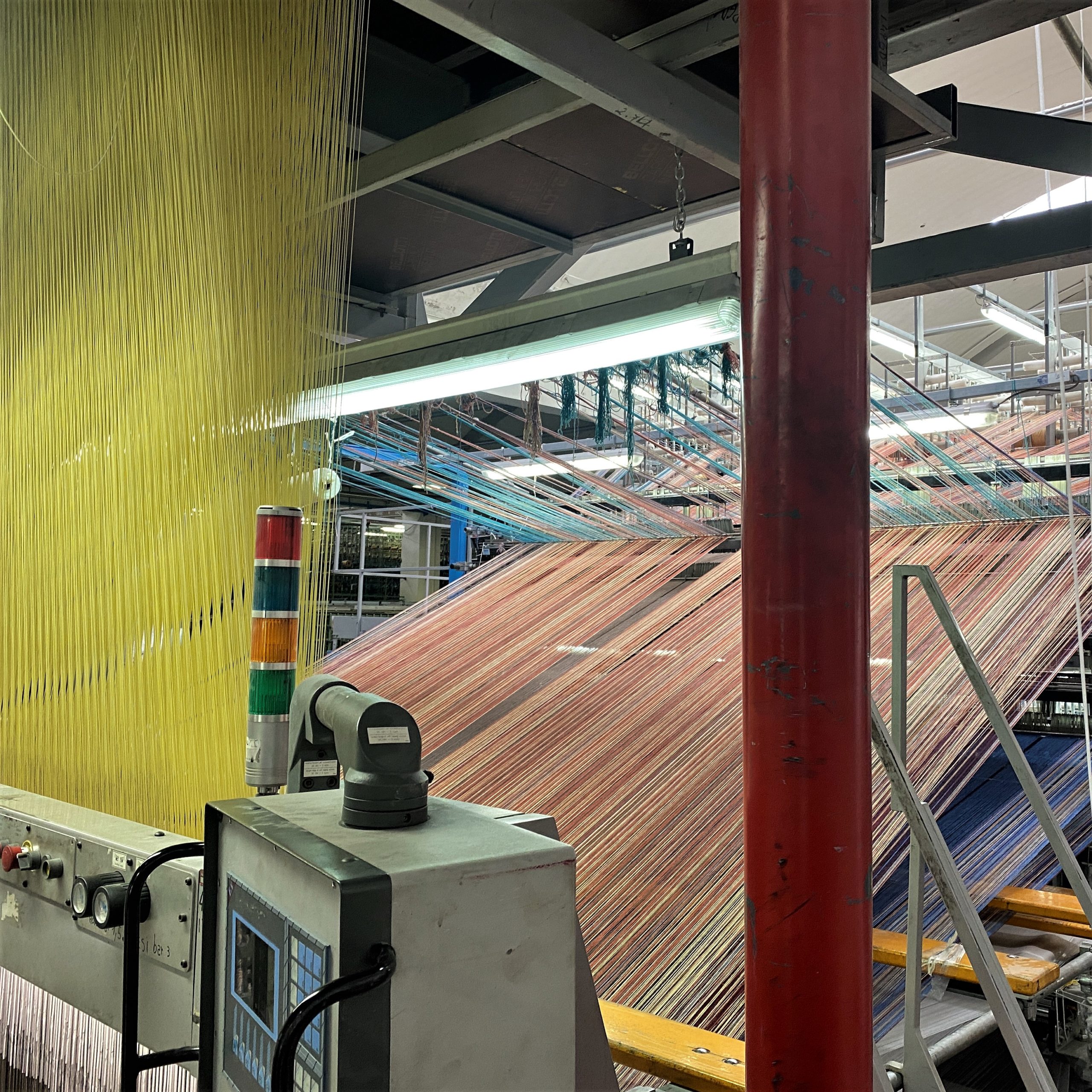
The Radici Sit-in carpet factory in the Seriana Valley. This time, I visited the factory with Móni, Fanni and Gábor from our Hungarian office: we regularly return with our colleagues because the techniques and possibilities of industrial carpet production are better mastered by seeing them first hand. The picture shows the special colored threads woven on the industrial looming machine.

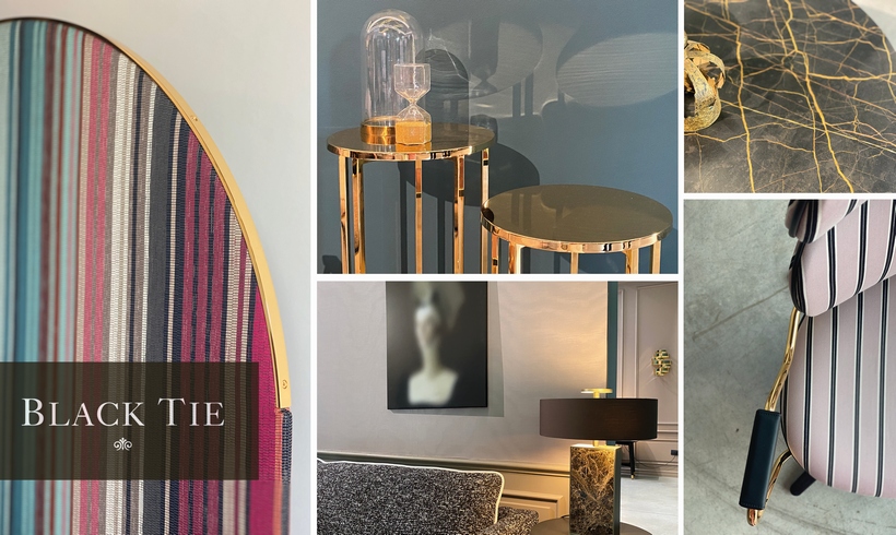
The Italian design brand Black Tie has a showroom in Veneto, it’s a stunning space in a hangar. Here you can touch and try a range of high quality upholstery, carpentry and metalwork products. As we are the brand’s representatives in Hungary, it is important to get to know all their products thoroughly.

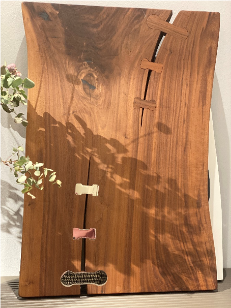
My favourite detail: an American walnut Jumbo table top with a unique decorative wood and various precious metals, in the showroom of Artebrotto known for its artisan woodwork.

The interiors of the Spirit de Milan nightclub are empty in summer, but the outdoor space is full, everyone is having a great time. The Spirit has been a hot spot for evening entertainment and nightlife in recent years, it’s a great place for aperitifs, dinner and digestivo. I’m sure I will come back very soon.

Louis Vuitton’s front, wallpapered with this year’s color trends. This summer the whole Via Montenapoleone is full of colors, I think, after the pandemic, Italians are more colorful, happier and more creative than ever.

Categories
Interjú

Meet our partners: Black Tie

Comfort, functionality, and aesthetics – these three important factors are in a lovely balance when it comes to the unique products of the Italian design brand, Black Tie. In the latest episode of the Meet our partners series, we talked to interior designer Eszter Radnóczy, the Hungarian representative of the Black Tie brand.

Timeless elegance and captivating beauty – that’s how the Black Tie brand, founded by Pierluigi Frighetto, can be described. When did you first meet them and what caught your attention about the products?

Many years ago in Milan, I was invited to the first Black Tie event in a private showroom at the Fuori Salone, that’s where I met the founders. I was very impressed by the really high comfort and strikingly elegant appearance of the products – these two factors are combined with a unique design and styling. What I really like about their work is that there is nothing, literally nothing, about a product that would give the feeling that it was designed for its own sake, prioritizing appearance over function and comfort. Their product range combines the three important factors in a balanced proportion, this is particularly valuable about Black Tie.

The brand blends Italian tradition and knowledge while maintaining a high quality in the fields of design, upholstery and aesthetics. How is it present in their products?

The beauty in the details and all the artisan work behind it is what makes Black Tie a unique brand. This is not only because of the high-end materials they use, but also thanks to the tapping technology and the sophisticated use and shaping of metal, wood, fabric and stone.

Is the composition of the sofas, the layering of the cushions and mattresses also important?

Absolutely, the comfort also lies in the importance of layering in case of Black Tie seating and sofas. This is what gives comfort and longevity, as well as the elegance that comes with using them, such as keeping the aesthetic condition of mattresses and cushions even when you get up from the sofa. Designers reach this by combining today’s mattress technology with tradition, combining layers of different hardnesses appropriately and using natural feathers.

What kind of interiors do you imagine these pieces being used in?

Black Tie’s furniture is essentially modern-classical in design. For minimalist spaces, I can imagine a single unique piece, while for more decorative, elegant interiors, the full range can be easily integrated.

Can you name some Black Tie products which have a special meaning to you?

The Kalida chair is one of my favorites, it is delicate yet very comfortable and its elegantly flowing lines are like a rose petal. One of their wonderful oval dining tables, Opera, has very exciting details: the inlaid wood surface, the marble and the copper threads are combined on the surface of the furniture. The Martin sofa‘s straight, clean lines and its long, elegant surface give a French impression, it becomes even more highlighted with the use of light upholstery and dark leather.

Black Tie products are 100% made in Italy, in the province of Vicenza, with the highest quality control and care. Why is this important?

At este’r partners, we always partner closely with companies that follow this principle. For us, European values, traditions and artisan experience from the past are important. These can be traced back not only to professional skills, but also to aesthetic sensibility and European, in this case more specifically Italian, culture.

Finally, if you had to describe the brand in just a few words, what would they be?

I would highlight the triad of elegance, extreme comfort and timeless design as the most important ones.

Categories
Construction

Fresh and fun new restaurant in Vienna: cook for yourself at Makery

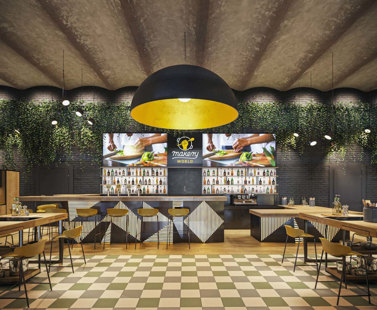
After its successful restaurant in Budapest, Makery opened its second unit in Vienna: the interior design concept of the franchise, based on an innovative community cooking experience, was created by este’r partners. With the cooking experience in focus the rough brick cladding, plants and a high level kitchen technology create a welcoming environment for all guests.


“The key word of the lively Budapest team is success so we were happy to further develop Makery’s original idea and its design solutions; now it’s a concept that can be turned into an international franchise. They give all guests a sense of victory while forming a community and knowing exactly that this requires a cozy, casual interior where premium kitchen technology and professional environment help to relax.”

The Viennese restaurant is in a populated area close to the city center. The location of the corner building, the interior and exterior spaces offered optimal conditions for the design team: their interior design solutions were created by optimizing local conditions. The characteristics of the rough brick wall and the Prussian vault, the features of the exterior doors and the bar counter were emphasized adding the image of Makery’s strong brand.


Tuned to success: cooking experience in focus

Makery is primarily a venue for meeting friends, co-workers or organizing family events. According to the owners’ idea, guests can prepare their dishes or even an entire menu cooking together and using the given ingredients on the basis of instructions, what’s more they can eat the meals together. The interior design concept required a well-thought-out spatial organization as every small movement and step taken can be significant in the cooking process, while a poorly placed drawer or counter could significantly worsen the experience.


Stable cooking base, enough space

The team of este’r partners organized the space around functionality: while the strict location of the cooking blocks suggests stability, most elements in the restaurant can be easily moved or converted. Designers had to pay special attention to the fact that guests work with chopped ingredients and lots of kitchen utensils, yet these details need to be structured in the space so that even less experienced chefs don’t get lost in the equipment jungle. The discreet presence of rough brick cladding, simple-lined furniture, Italian tiles and flooring allow guests to focus on the cooking activity and the community experience.


Cozy welcome, fresh experience

The design team focused on a cozy and relaxed arrival experience. Guests can wait for their team at the bar counter; this reception area provides a great place for guests and staff to meet and connect. The calm atmosphere is enhanced by the characteristic Makery color scheme: the meeting of yellow-black colors, the use of natural materials and solid wood, and the atmosphere of industrial buildings is also present. Pleasant and warm lighting and large brick walls boost the casual atmosphere.

Increased hygiene

Adherence to hygiene guidelines both in the preparation areas and in the front of the house were utmost important while creating the interior design solutions. Surfaces can be cleaned easily and quickly, trash cans can be opened with a pedal, almost all surfaces can be washed and easily maintained. It was an important request of the client that different groups could cook separately and at a distance from each other. The spatial organization creates an airy, never-crowded space even in case of side-by-side kitchen workflows.


Metropolitan design, local flavors

An important part of the Makery concept is that it also provides a unique experience for visiting tourists, who can try the preparation of local traditional dishes with professional help. All nations feel warm and comfortable in the metropolitan, fresh design, and the interior design solutions also allow for international adaptability, ie franchise expansion opportunities.

The interior design team of este’r partners has brought the fresh, vibrant interior of the restaurant in Budapest to the Viennese one. The popular and well-tried interior design solutions are now available in a new location. The alternation of the visible industrial elements, the geometric lines and fresh design add a lot to the community experience. The space is modern, cozy and natural, making guests feel that it’s good to be here and great to cook together.

Photos by Makery (Thomann Bence)
Categories
Interjú

Celebrating two years of creativity in Milan with interior designer Eszter Radnóczy

Two years ago you opened your Italian partner office in Milan. What were the achievements and how was this period?

Our most important goal, when we founded our partner office in Milan has been fulfilled: we can work and design together with our partner, Stefano Napolitani and Waves Project Ltd. We are looking for international opportunities in our cooperation, and this year we were able to present an exciting project together: the elegant home in a porcelain shell is the first visible expression of the values we share.

Both Italians and Hungarians were severely affected by the pandemic this year. How was it for your company?

The past year was a real test for the entire construction industry, I hope that an upswing is coming now. I always look at difficult situations with a glass-half-full kind of attitude, my team consists of creative colleagues who always come up with good ideas in unexpected situations. We are full of joy which carries us forward, the world is now wide-open in front of us.

Designing in Milan is a completely different experience than in Hungary. Can you describe the differences?

Milan is one of the most important and vibrant urban centers of the world. The city is getting greener and more livable; with creativity and conscious planning designers are doing a lot to follow this direction in the future. Italians shape their cities with a great sense of space, and their approach and experience are of international qualities. What I really like in Milan is that even simple residential buildings are designed with ease and creativity in mind.

Your Italian partner, Stefano Napolitani is the chief designer of the architecture studio Waves Project Ltd. Can you tell us about him and the cooperation?

According to our Italian partners, design and architecture are strongly connected to each other, these two areas are in harmony. Stefano runs our partner office with great experience and a practical approach. In Hungary, we rarely see this fresh, playful approach that characterizes his work. It is also due to his personality that he claims: architectural and interior design works with maximalist attention to detail and value creation, but designed loosely, lightheartedly without over-thinking is what makes people happy. It is great to have a partner like him, I truly enjoy working together.

Photo: Attila Glázer

Categories
Construction

Elegance in a porcelain shell: este’r partners international work with Waves Project Ltd.

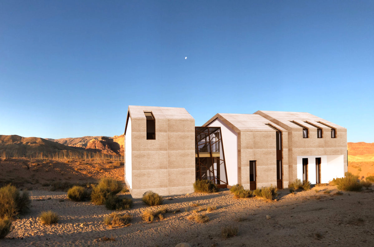
Interior designer Eszter Radnóczy and her team of este’r partners created an elegant, unique architectural and interior design concept for a client on an international project. The studio, in collaboration with her Milanese partner, the renowned Italian architect Stefano Napolitani, founder of Waves Project Ltd., designed a three-part building with stone porcelain cladding with matching, restrained but special interiors.

“We introduced a plan to our client in which we worked with generous spaces where the unique architectural and spatial experience are both very important. The building, which becomes mysterious with a level shift, a hidden garden and stunning interiors, is at once clean, contemporary, but fully personalized,” says Eszter Radnóczy.

The characteristic element of the house is the ventilated stone porcelain, which is used as both a roof and a facade cladding, wrapping the entire building without a break or split. Windows and doors placed in the roof angle continue downwards, connecting the three parts of the building by a glass staircase. The generous stone porcelain cladding also provides high-quality, unique technical solutions, such as rainwater drainage or shading was also a serious challenge.

The house is based on the harmonious alternation of enclosed and open spaces and this continues outdoors as well: while the upper garden communicates openness and is a warm space perfect for gatherings and welcoming guests, the deep garden is a more private, mystical and cozy oasis. A particular feature of the house is the spectacular but intimate overflow pool: this and the study, related to space, are both a spot for relaxation, reflection, focus and silence.

The house is built on a triad of stone porcelain, natural stone and wood, designers followed the tone-in-tone principle. The style of the whole house is uniform, its color scheme is soft and sophisticated. Wood paneling appears everywhere, but as an inverse solution. The recessed garden level and the ground floor, for example, were given cold flooring, the same as the outdoor facade, bringing outside and inside living together.

KITCHEN AND LIVING ROOM

The space division is consciously planned, the exterior cladding of the house runs in and continues along the longitudinal axis: based on the designers’ decision, only the perpendicular partitions were given a dominant cladding which is completely different from the outer walls of the house.

The high-tech kitchen is hidden behind the wood paneling: the infrared-sensing, glass-fronted Valcucine kitchen opens up supporting touch-free interactions and it is made with industrial technology but features cozy and well-equipped, ergonomically developed functions. The kitchen and its surroundings, because of the dominant ceiling and wall cladding, are optically detached from the living room. There is a custom-designed bookshelf in the living room, which hides additional kitchen tools and food preparation appliances on the back wall. The furniture and lamps are iconic design pieces that, in addition to the comfort functions, capture the eye with their design and sophisticated details.

BEDROOM

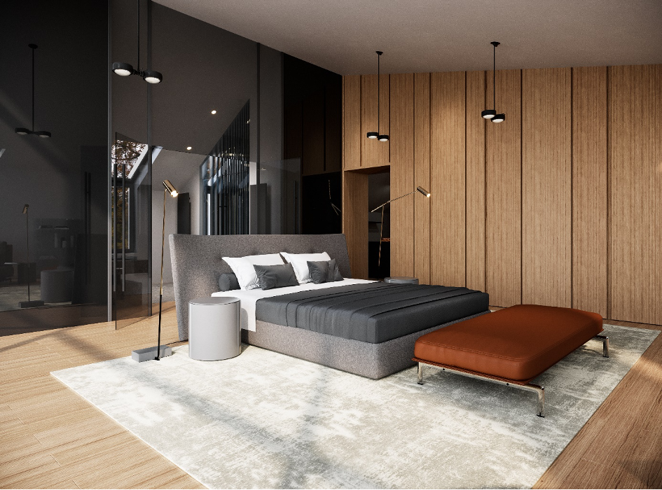
The huge wood paneling of the bedroom faces the glass wall. The bed is given a central role in the space, here as well the goal was to provide a space experience. With this solution, the designers provide a kind of floating feeling: the Poliform bed, the sofa, the Occhio lamps, as well as the suspended spot lighting are almost floating in the room. Behind the headboard there is a huge glass wall separating the bathroom foyer from the bedroom, which has a high end bathtub and a design washbasin.

BATHROOM

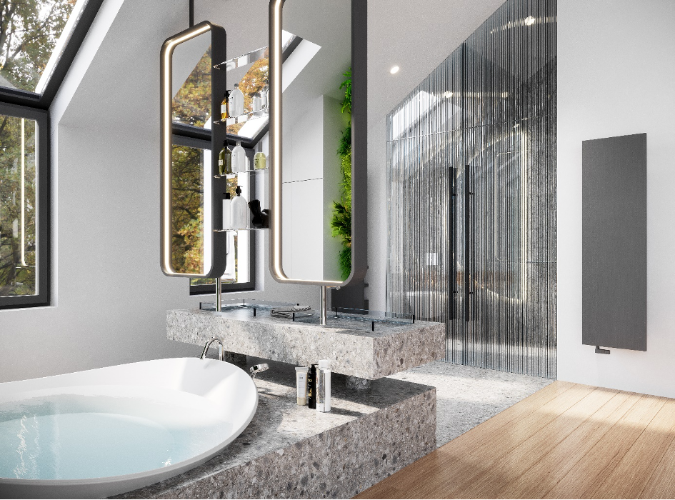
Italian designer, Antonio Lupi’s Dune bathtub was placed in that part of the bathroom which communicates with the bedroom, where it can softly slide into the pedestal. Its shape recalls that of dunes with a perfect design for relaxation. The free-standing, uniquely designed washbasin and mirrors shape the space and serve as room-dividing solutions, while all the necessary functions are included. The enclosed parts of the bathroom, the shower and the washbasin have been moved to separate rooms – these functions are separated by lightweight glass walls for letting light in. With the green wall, the garden experience is reflected in the bathroom.

CLOSET

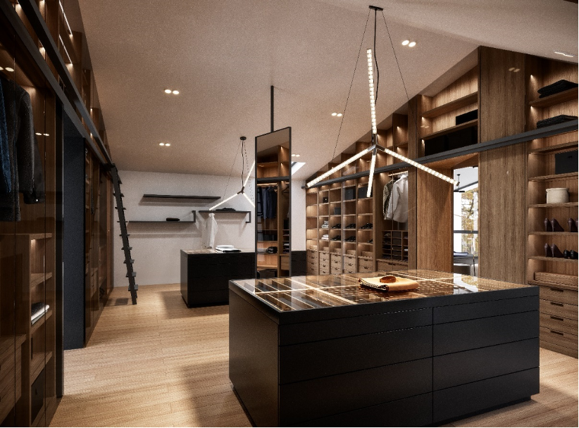
The closet is custom-designed and was planned with the help of the Italian colleagues of este’r partners. The glass-enclosed cabinet sections have reflective gray glass, this gives the possibility of controling the visibility, depending on the intensity of the light entering the cabinet. The two central elements of the mirrored wardrobe are the island, richly and elegantly divided with organizers, which is more emphasized in the large space by the dynamic, modern crystal chandeliers made by Manooi.

Based on the design by este’r partners and Waves Ltd., every space and interior design feature of the house is detailed, coherent and has been carefully thought out. The whole house is airy: unique space experience, fantastic angles, and the garden beyond the glass walls provides a stunning look to the elegant building.

Categories
Kivitelezés

Clear lines for clean food: dr. Lenkei’s Clean Food flagship store is open

The first flagship store of dr. Lenkei’s Clean Food brand has opened in the 15th district, in Mehola department store. The interior designer este’r partners focused on simple lines, clear spatial organization and the use of natural colors and materials when designing the first store of the franchise chain. This sleek interior design concept provides the right base for a diverse and colorful product range and conveys the philosophy of the client, Lenkei company: natural, clean food.


A striking element in the symmetrical design is the so-called moss gate: the inside of the entrance door is painted dark green and partly covered with flat moss. The entrance is not only a visual element, but also a spiritual “tool”: a symbol of purification that compels customers and those interested to enter the space in a transcendent state. The moss gate is powered by air humidity and is custom-designed.

The key elements of the store are the designer lamps suspended from the ceiling, positioned above the cash desk and the gondolas: this is not the first time that the team of este’r partners has used the natural-looking Paper Up lamps made from recycled material.

On both sides of the space there are modular shelving systems from AluStyle frames with LED lighting hidden in their columns, with a drawer element at the bottom. The designers integrated a sink and coffee machine into one of the sidewall shelving systems. The product information on the shelving system can be placed in holders, and colored posters above the shelves display the origin and the background of the products. Every dr. Lenkei store has a café corner where people can taste the coffees available here. A discreet, special solution is the magical pixels on the coverings created from the products of Vogue Ceramica and Graph Color, above the reception desk and on the back wall: the delicate Italian design brings playfulness into the space.

The concept of interior design, based on the green-pastel-natural wood triad, aims to convey simplicity and clarity: the team of este’r partners created the first store of the franchise with a harmonious, clean design.

Interior design: este’r partners

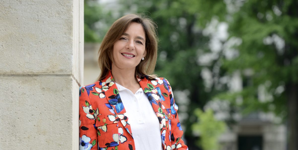
Lead designer:  Eszter Radnóczy

Designers:  Mónika Vajta,  Fanni Gyurics

Floor and covering: Vogue Ceramica

Design lamps: Paper Up

Wall painting: Valpaint Valrenna

Shelving system: AluStyle GP3

Bar chair: Colos

Moss gate: Virágkoktél Design

Categories
Construction

Renovated Buda Civic Casino reopens as cultural center in Krisztina square in Budapest

The former Buda Civic Casino reopens in the 1st district of Budapest as the Sándor Márai Cultural Center: the building has undergone a careful renovation respecting its past and architectural values as a community and cultural centre, but also integrating new functions. The building was renovated by the plans of interior designer este’r partners (Eszter Radnóczy) in cooperation with architect studio Jassó Építészműhely (Sándor Jassó and Adrienn Bársony) while the consturciont was completed by Laki Zrt.

The headquarters of the Buda Civil Casino was built in 1893, according to the plans of Imre Francsek, sr. The casino operated on the first floor, with several lounges, drawing and games rooms next to the ballroom. There was a restaurant in the basement, several shops on the ground floor and three rental apartments on the second floor. In the corner shop on the ground floor there was first a beer hall, then a bank, later the confectionery of József Auguszt from 1901 to 1915, and in 1936 the Philadelphia café moved here. After the Second World War, until 1989, the building was the district headquarters of the Hungarian Socialist Workers’ Party (MSZMP), the Hungarian Young Communist League (KISZ), the Pioneer Association and the Workers’ Militia, with a hairdresser and a delicatessen on the ground floor. The latter operated under various company names until the start of the renovation. For several years, the Municipality of Budavár has taken steps to buy out the flats and offices when the building was split up and sold, and eventually the entire building became the property of the Municipality. During the measurements, the design team first encountered fragmented, divided, narrow and gloomy spaces.

From the beginning, the municipality of the 1st district sought to save, renovate, and add new features to the building. The building is of architectural significance; its most important spaces, even after previous simplistic restorations, are the imposing first-floor ballroom and the main staircase. At the start of the design, the inner courtyard, the ballroom, the street façade were only faintly reminiscent of the original patina of the building. In addition to the functions and modern expectations that serve the needs of the cultural center, preserving, respecting and restoring of the existing values were all priorities throughout the construction.
The tower of the building was destroyed during the siege of Budapest in 1944–45, and its façade was severely damaged. The façade was restored according to László Lux’s plans in 1946, but the corner tower was not repaired, and the façade was completely denuded, including the intact parts. The restoration of the corner dome was a priority in the design process. The appearance of the corner tower is important not only outside but also inside the building. Both the performance hall and the dance hall have a great view from this point, from here we are able to see the church on Krisztina Square, the square and the Buda Castle.

A wall analysis was carried out before the construction began, during which it was visible that after the renovation of the façade in 1946, the entire façade surface had been completely re-plastered, so no fragment of the original architecture remained. We know the original condition of the façade only from archive pictures and postcards. The former segmentation of the façade of Krisztina Square and Alagút Street, the destroyed corner tower, as well as the main staircase and the ballroom have been restored based on historical and archival research. Unfortunately, there were not enough resources available for the complete reconstruction of the former detailed façade ornamentation.

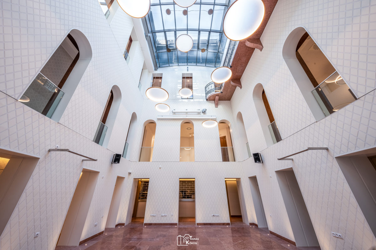
From the beginning of the design, it was important that the historic restoration of the building is carried out by professionals with authenticity. A new space was born by covering the inner courtyard, which became the centre of the house, as it connects the current spaces. This area needed to be reinvented in terms of interior design.

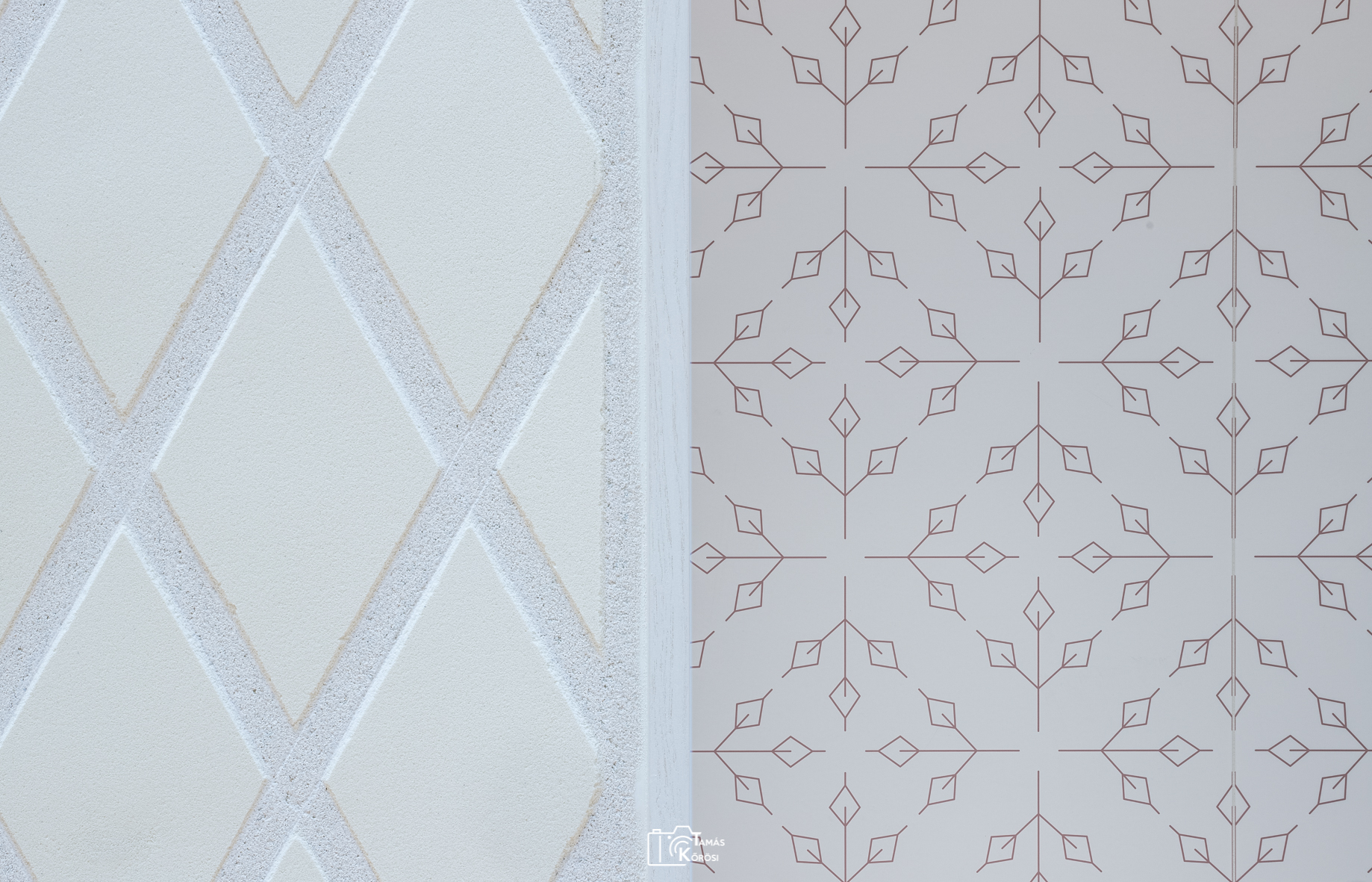
The inner courtyard façade was plastered with a special stencil technique. Among the above mentioned solutions, the designers used a unique structured plaster solution in the façade decoration, which adds a subtle ornamentation to the new community space. The pattern of this is taking forward the idea of the original ornamental painting’s geometric pattern found in the ballroom.

The surface of the modern central parts is formed by a printed patterned Kerlite covering, which provides a unique atmosphere to the corridors, as well as giving the courtyard exciting insight and depths. As this surface is closer to the eye of the visitor, the pattern is richer in detail, it was possible to show the inner geometric stencil pattern in a more ornate way with the help of modern technologies. Applied decorative art was part of the graphic design, it intertwines with the sleek control system as a visual communication tool. The decorative art used was part of the graphic design it intertwines with the neat control system as a visual communication tool.

During the renovation, the building has returned to its original splendour. It can host artistic and community events and can be a remarkable centre of cultural life. Unique spaces and spatial connections make every moment festive during any events, classical music concerts, festivities, balls, weddings, exhibitions and other art performances.

Categories
Construction

Photo gallery of the renovated Budai Civic Casino

Photos by Tamás Kőrösi