Este’r partners designed a high-end apartment for their client in the exciting industrial environment of Budapest’s 11th district. In an interview, interior designer Csilla Szabó shared some interesting details about the project.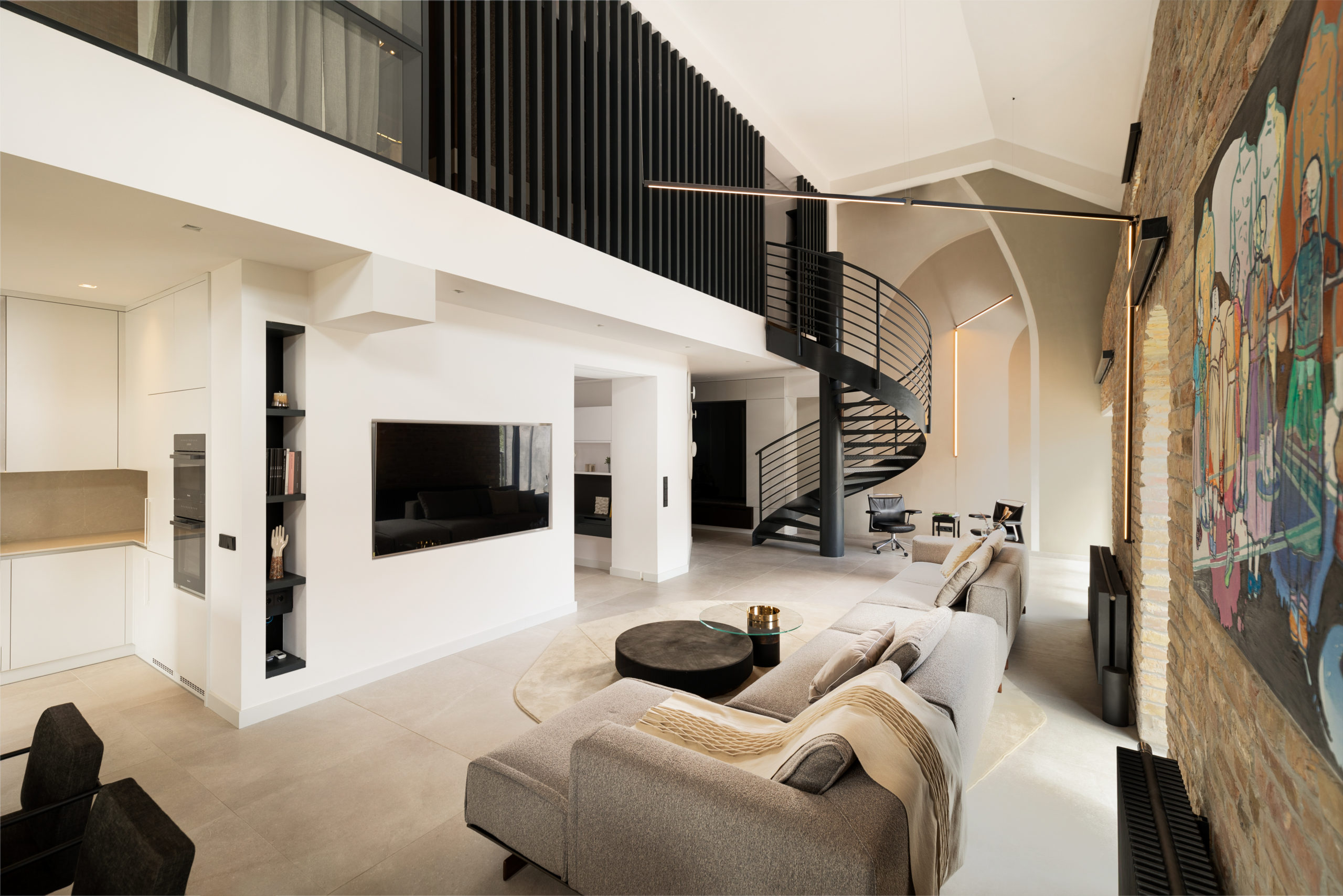
What is so special about this industrial part of Budapest, where the newly planned apartment is located?
As the historical records show, in the second half of the 19th century the milling industry developed significantly in Budapest, and several large steam mills were built. It was during this period, in 1879 that the Gizella Mill was built on Soroksári Street in the 9th district of Budapest, designed by Károly Bachmann, commissioned by the Krausz-Moskovits family. After the change of regime, the mill was listed as a historical monument, the interior was demolished in 2000, and then in 2009 office buildings, a hotel and residential apartments were built inside the remaining walls. This is where our client bought a loft apartment, which was designed by the team of este’r partners and where we worked on the interior design execution all the way to the handover of the project..
What was the client’s request and what was the starting point for the project?
The structural design of the apartment with exposed brickwork inside, ground floor and mezzanine floor, stairs, terrace was suitable for a small office; the owner requested a change of function to convert it into an apartment for himself. In terms of design, simple, modest interiors were the main focus, which was a real joy for us, as we could keep the emphasis on the space. However, the most important aspect was to achieve a unique look with subtle elements in the space. The spatial structure provided us with a fantastic basis for our work, the challenge was to create residential functions along the inner gallery (an area without frontal windows).
Tell us about the spatial structure, the division of the space, the room layout.
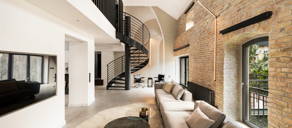
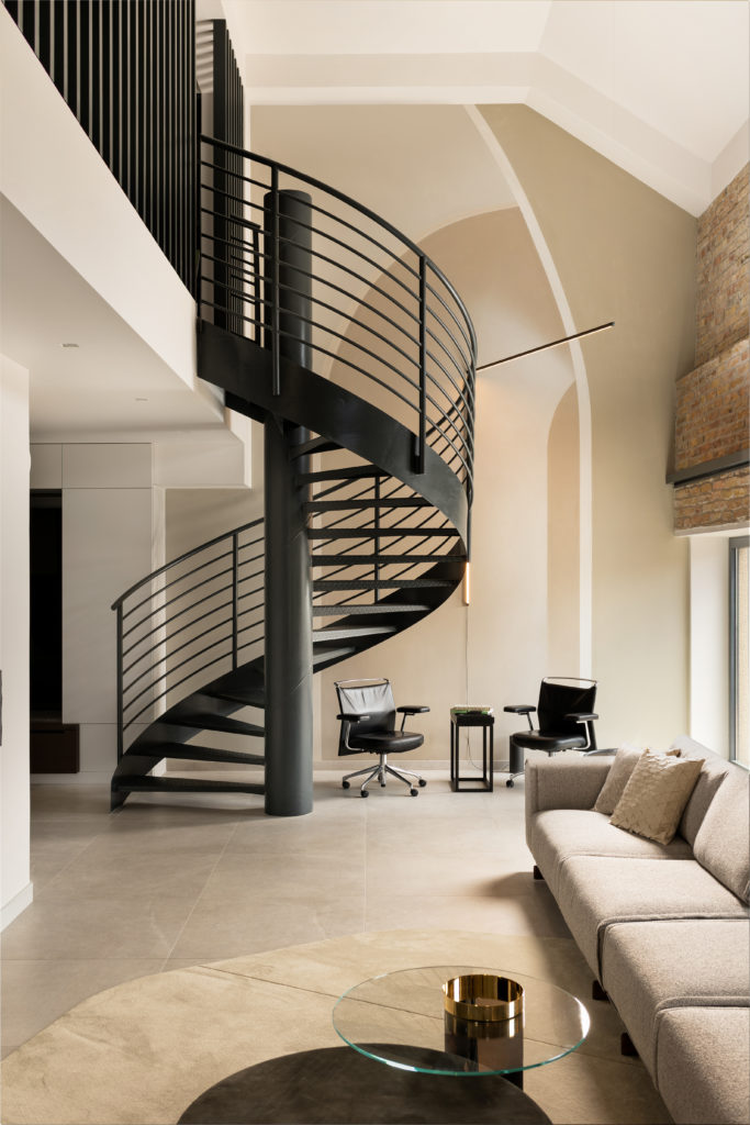
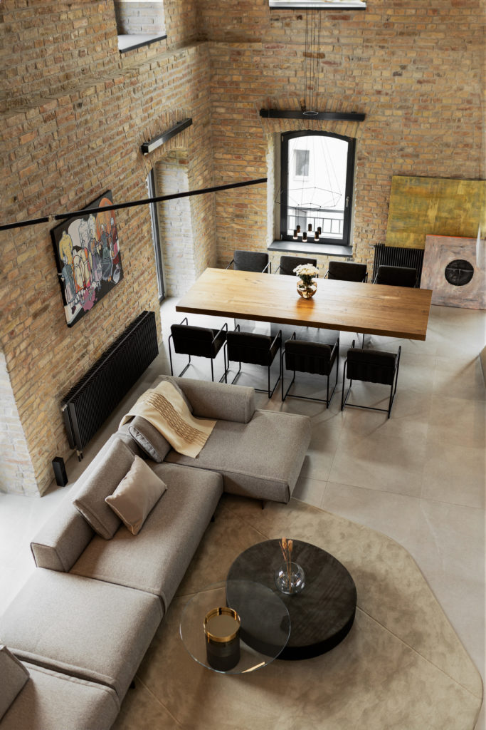
We planned to keep the original spatial structure but develop the apartment function: the windows on the double level illuminate the living room, we did not plan a wall in the open space structure, the owner requested the kitchen function on the ground floor to be created with windows, so the ground floor guest room/study room was designed without windows, and on the ground floor there was also a utility room and a bathroom with sauna. Opening up the interior room, connecting it as much as possible to the large space, and defining it with large sliding glass doors were also important design considerations.
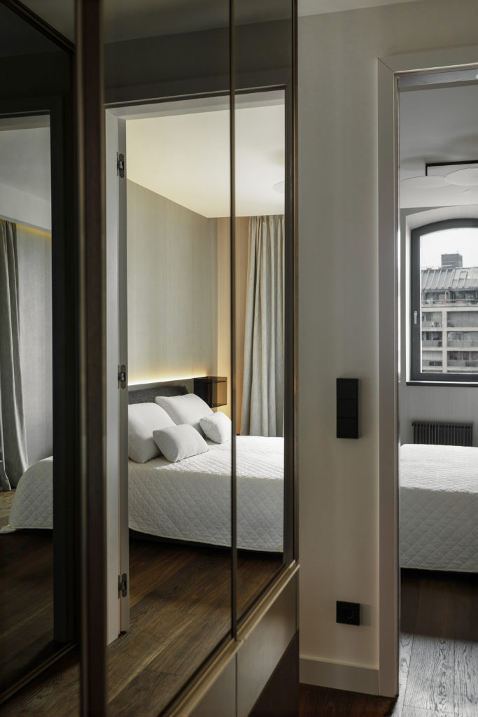
The upstairs guest bedroom is also designed as an interior room and although the upstairs bedroom has a small window facing the Danube, both rooms have been designed to maximize the amount of light from the gallery through a glass wall.
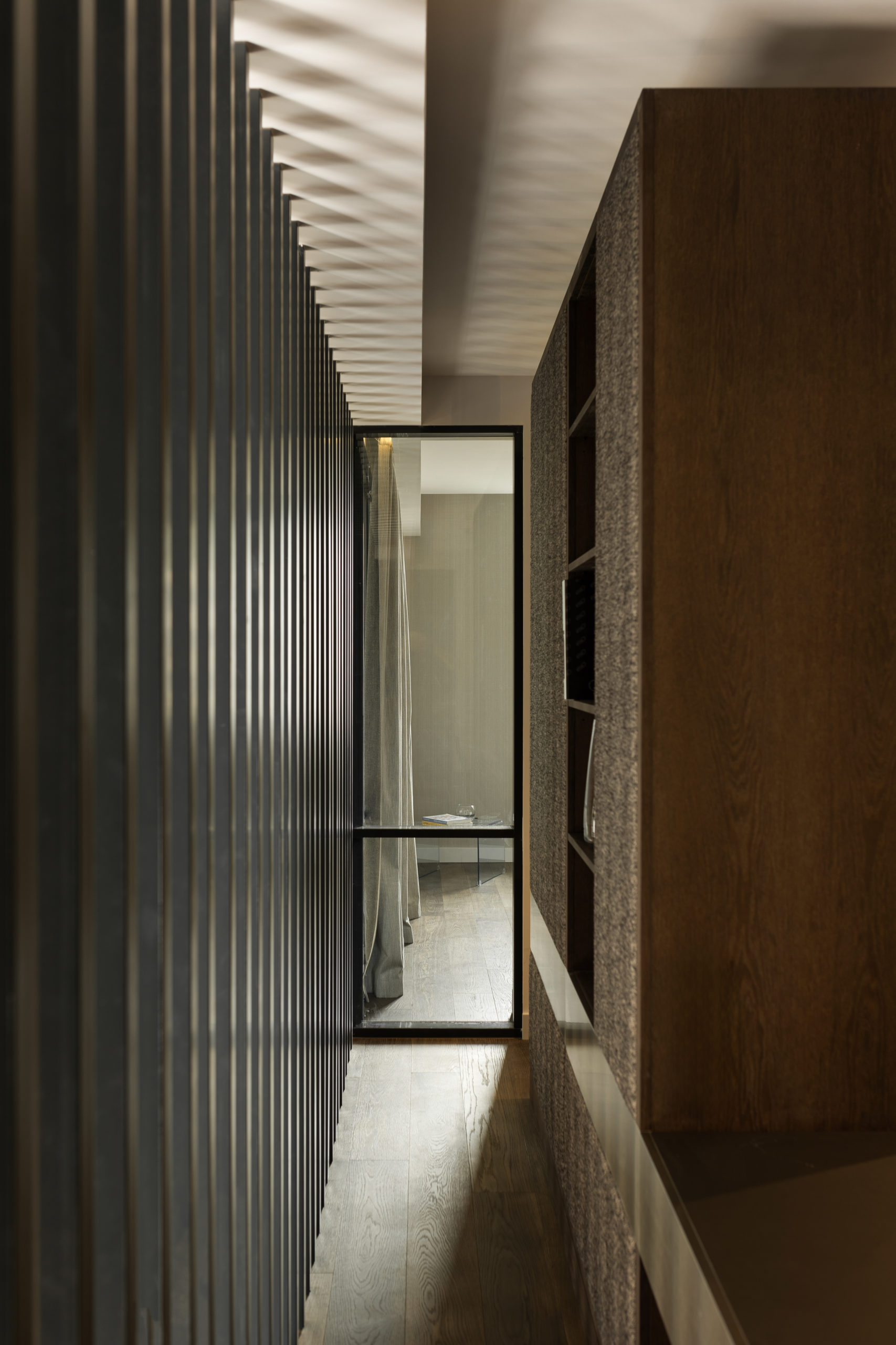
In the design of the corridor with walk-in closets connecting the rooms, transparency and the maximum amount of light from the gallery were also key factors.
What exciting solutions did you implement in the living room? What makes this space unique?
On the one hand, the internal glass and lamella wall system on the gallery level, which encloses the upper level and enriches the original spatial structure.
In the original space, which was bordered by exposed brick walls, a single large white painted partition wall seemed strange in the space, so a mural was painted on this surface to break through the wall and extend the space.
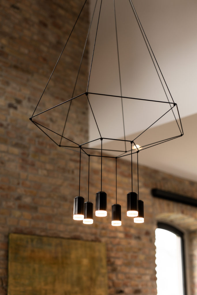
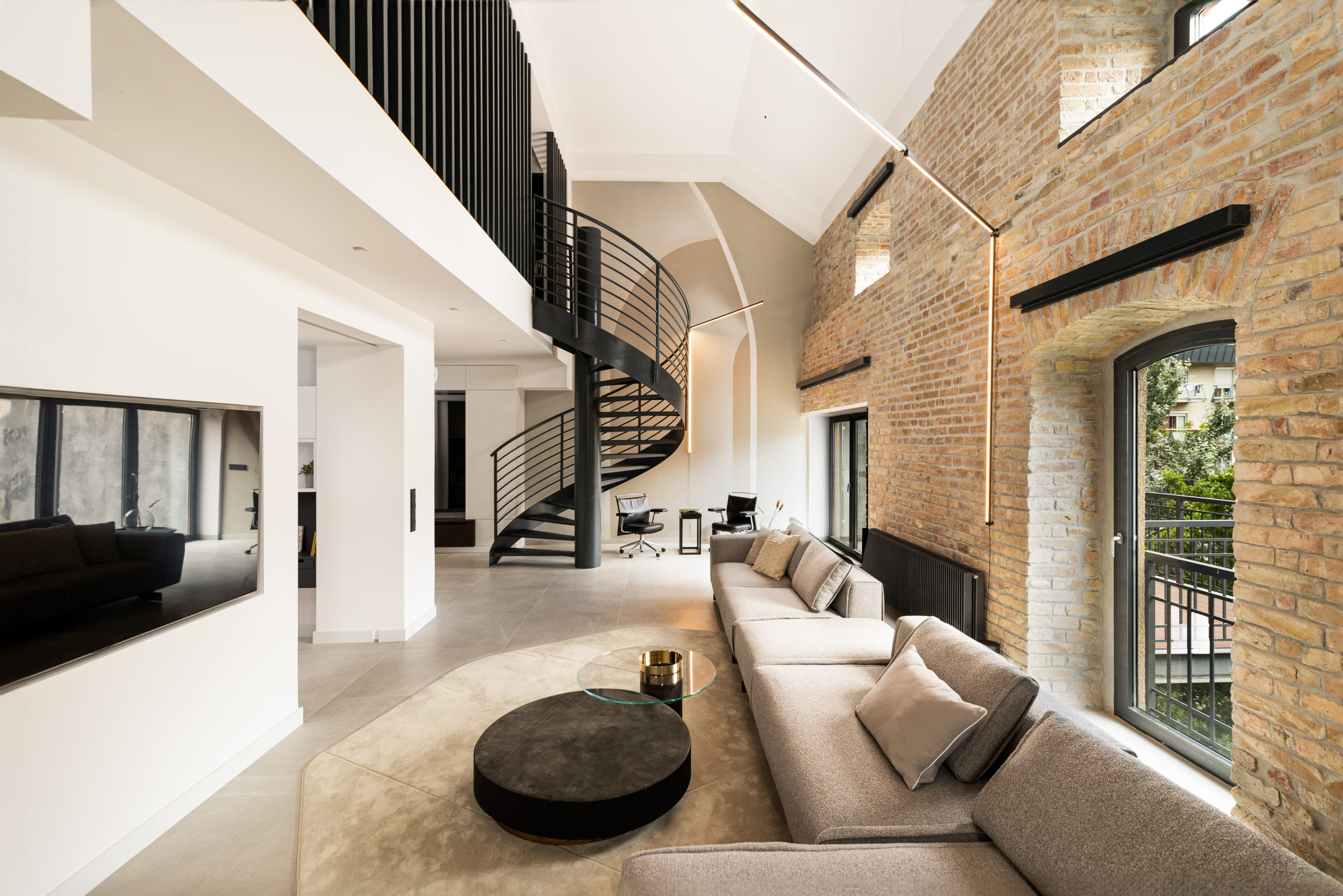
The lighting was the most exciting task in the vast space of the living room, replacing the previous industrial lamps and designing lamps that are rarely used in residential spaces due to the lack of ceiling heights. These lamps are delicate, light, airy and blend almost imperceptibly into the space.
How does a special spiral staircase and brick wall transform the apartment?
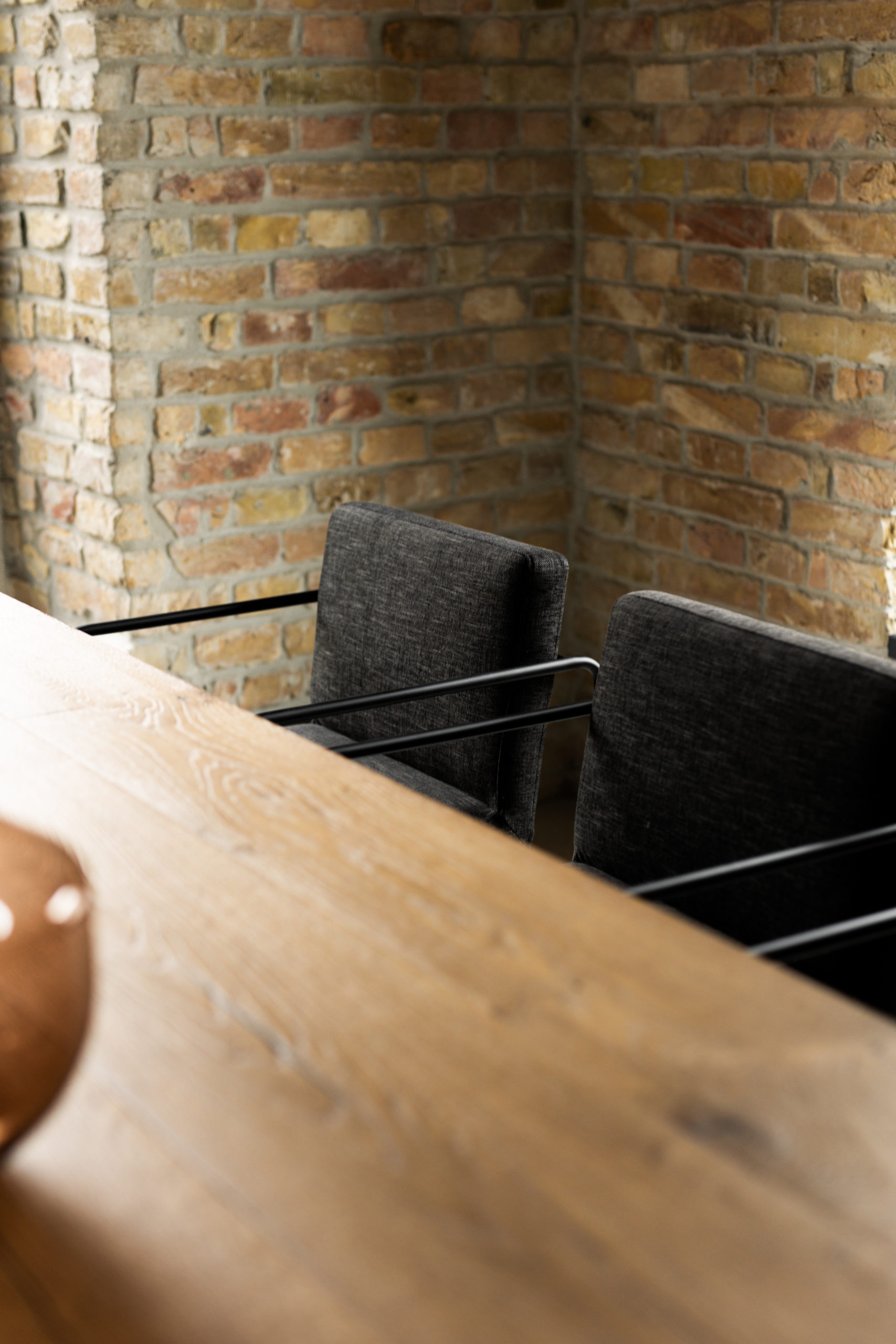
The original staircase was retained for cost-effectiveness reasons, and it also functions well, being comfortable, wide, and good at breaking up the angularity of the space, as well as having a sculptural effect. The brick wall in its original condition was not suitable for the owner, so we replaced and repaired the missing and damaged elements, and impregnated the surface. In the completed apartment, it became a prominent and dominant element of the space, which no longer required the use of other decorative interior elements.
Tell us about the unique solutions for storage and lighting.
With a restrained, more geometric use of architectural lamps, the principle of less is more works throughout the whole concept, including the lighting. In the interior room on the ground floor, we designed a carpet with custom-made graphic illuminated with adjustable lighting on the ceiling.
In the living room, the suspended linear lighting from the vaulted ceiling appears as a bracket on the brick wall surface, but there are no fixtures on the unique brick wall, we installed them on the floor.
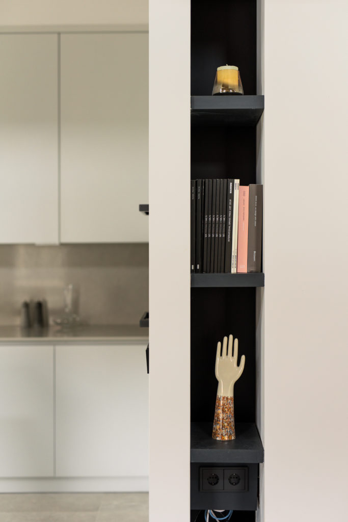
Storage solutions include a number of exciting elements, such as wall-mounted hall and kitchen furniture, or custom storage units covered with full length mirrors in the bathrooms – these do not actually look like furniture in the space.
What makes this apartment truly a ‘Budapest home’ and gives it an ‘este’r partners style’?
We have utilized the existing elements of the renovation of the historic industrial mill, focused on its structure and finishes, while preserving its architectural character, and this has been supported by the interior design from start to finish with unique elements and solutions to create a cozy atmosphere for our client in this exceptional space. We agreed to complete this project with the contractor, keeping a constant eye on costs, preparing and delivering this apartment during the most difficult period of the construction industry in recent years, so I can honestly say that this is our work as the team of este’r partners in every aspect.
