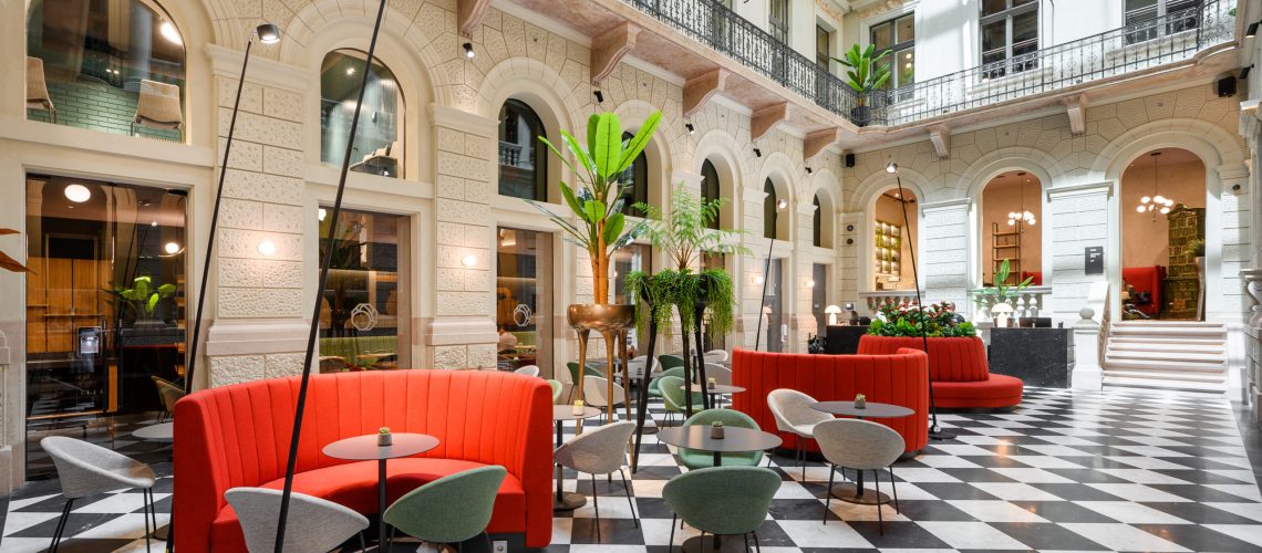
Hotel Oktogon opened its doors in June, the building was originally a much-loved palace on Andrássy Avenue, later a public library and, for a time, one of Budapest’s favorite nightclubs. After three years of renovation, the building is now open as a hotel, designed by este’r partners interior design studio (lead designers: Eszter Radnóczy, Hajnalka Zellei) and architectural partner Archikon.

The neo-Renaissance palace at 52 Andrássy Avenue was built at the end of the 19th century, between 1884 and 1886, designed by Henrik Schmahl, who also designed the Párisi Court and the Urania National Film Theater, and developed by the Swiss-born brewer and mill owner Henrik Haggenmacher.
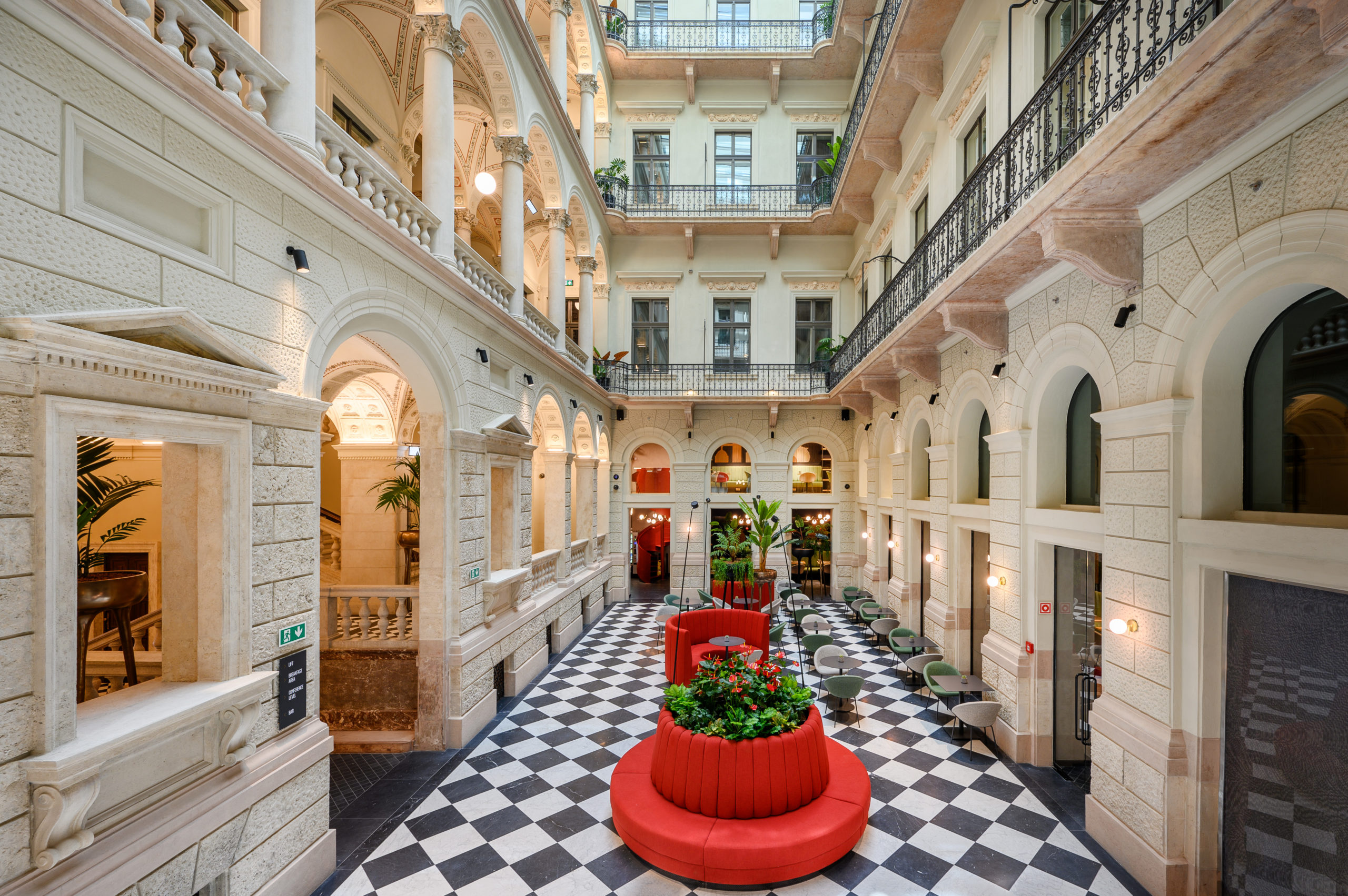
The elegant palace has been restored and renovated, retaining its original character, the inner courtyard behind the representative gate now features a lobby and a breakfast area instead of horses and carriages, the details of the ceiling in the corridors were given back their original beauty, while the interior design remained sporty and casual, designed to match the style of the hotel’s guests.
In our short interview, we talked to lead designer Eszter Radnóczy about the interior design of the palace’s renovation.

What are the details and stories from the history of the building that were important to you in the design process?
The history of the Haggenmacher and later the Dreher family and their numerous real estate investments in the center of Budapest are all remarkable. The Haggemacher Palace is characterized by its central staircase, painted arches, ceilings and natural light. All of these outstanding features have been restored to their original appearance and represent a significant legacy for the future. Being part of its rebirth has been a long, challenging process, but definitely an exciting experience.

Can you describe the atmosphere in the lobby?
The architects have linked the part of the historic building to the contemporary staircase in the lobby. Now this space has a new function and meaning with the former open courtyard becoming a space enclosed by a glass roof. While the flooring and facade elements follow the style of historic buildings, the furnishings and installation elements are adapted to the hotel’s youthful, cosmopolitan atmosphere. They are colorful, clean, comfortable and vibrant.
What solutions did you use in the historic room?
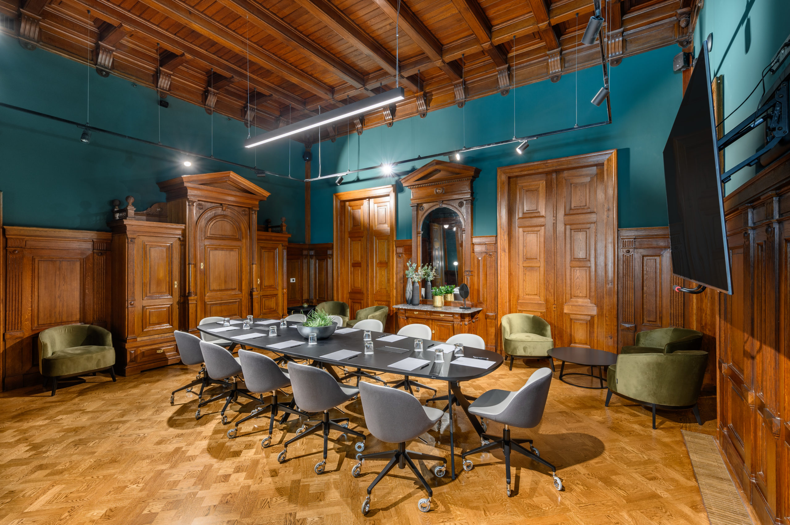
The rooms are characterized by their original wood paneling, which has been restored to its original light walnut color. The large size of the rooms allowed the bathroom blocks to be positioned in the center of the room, leaving the original coffered wood paneling on the exterior walls. This central spatial planning allowed us to divide the space within the historic room into a bedroom, a hallway and a living room. The walls and ceilings are dark green, with deep shades to match the wooden panels. The furnishings are a classic-modern combination.
The hotel is sporty and cool, but also elegant. What does 3 stars “allow you to do”?
The building has a lot to offer in terms of experience and value, I think it is one of the most exciting houses on Andrássy Avenue – it was beautiful even before the renovation. The new design brings new life, freshness and complements the heritage of the period, without damaging the original, but renovating it to serve new values, modern comfort and functional and aesthetic needs.

What are the design highlights of the building?
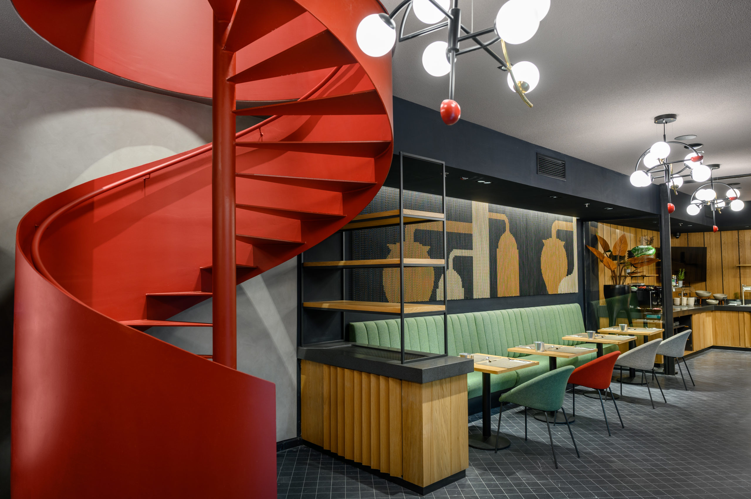
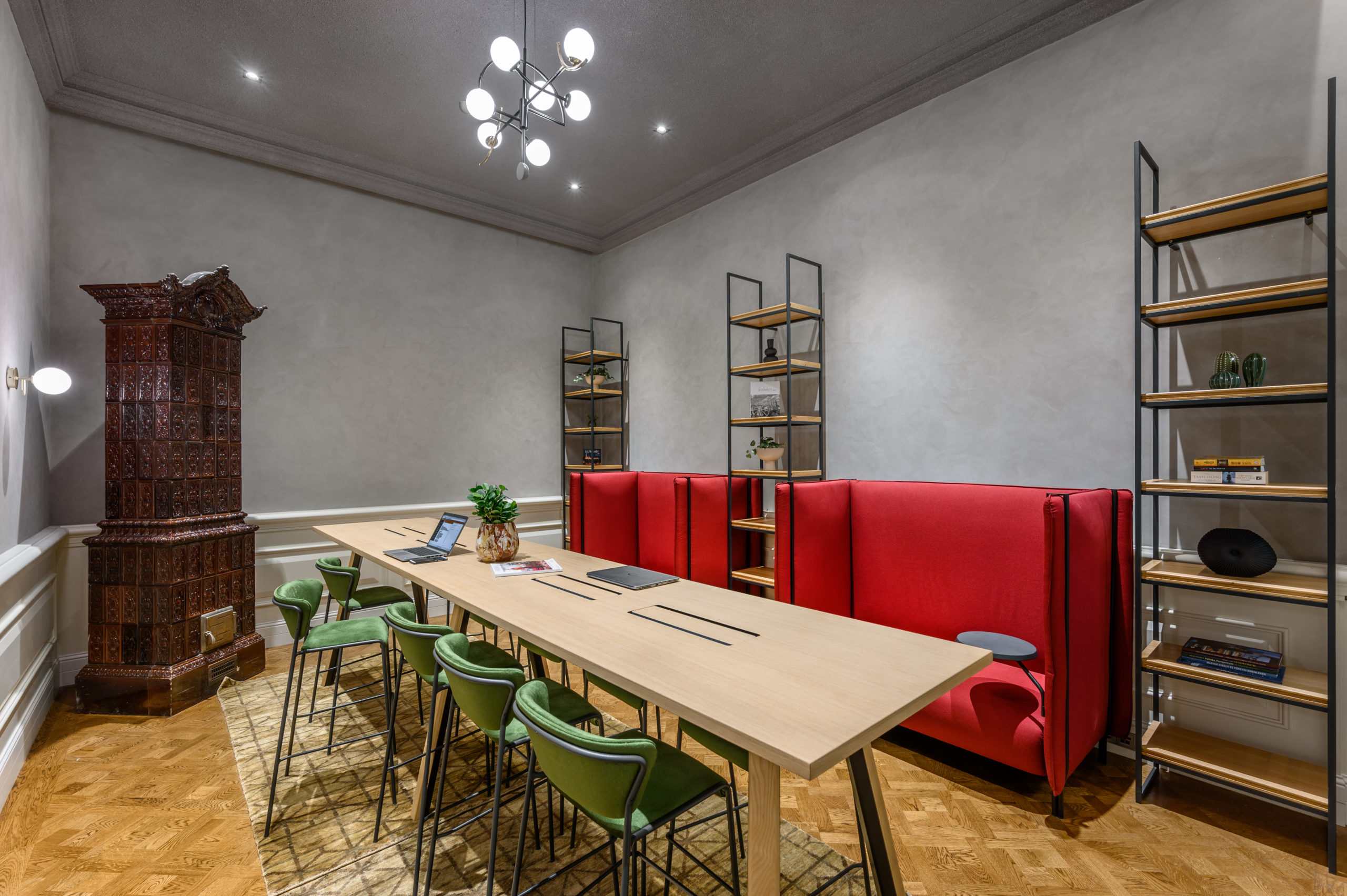
The basic building elements were dominant: warm gray stone decorations, pillars, cornices, black and light gray diagonal checked flooring, and painted ceilings with leaf patterns above the staircase, this color composition was discovered during the renovation. In the interior design, dynamic colors were used throughout the non historic area of the building, with a trio of basic color combinations of red, green and blue and their pastel versions featuring the whole building, sometimes together and sometimes separately. The rooms are bright, cheerful and compact, the quality of the color and the use of materials make them more interesting. The airy appearance and mixed function of the lobby is also quite fascinating, it is now both a bar and a breakfast area. The reduced and curved pieces of furniture are accompanied by objects that are deliberately eye-catching, such as long neck floor lamps and flower pots that enhance the visual experience.

Photos by Tamás Pál

